A patterned dress already speaks loudly. A scarf should support its message, not compete with every flower, stripe, or geometric shape. Learning how to coordinate a scarf with a patterned dress begins with balance, color awareness, and restraint. The goal is not perfect matching. It is visual harmony.
Fashion designer Michael Kors once said, “I’ve always thought of accessories as the exclamation point of a woman’s outfit.” That idea offers a useful starting point. A scarf can add the final emphasis through color, texture, or movement. However, too many strong details can make an outfit feel crowded. Sometimes, a quieter scarf works better.
This guide explores seven practical ways to build that balance. You will consider dominant colors, pattern scale, fabric weight, knot placement, and seasonal texture. Picture a navy floral dress with a soft cream scarf resting loosely at the neckline. The result feels intentional, but not forced. A small geometric scarf might also work, though the contrast could become distracting.
There is no universal formula. Personal coloring, body proportions, and comfort still matter. Some combinations may look excellent on paper and awkward in a mirror. That is normal. Step back, check the outfit in natural light, and notice what your eyes see first. A little uncertainty can reveal what needs changing. These tips offer reliable guidance, while leaving room for individual judgment and creative mistakes.
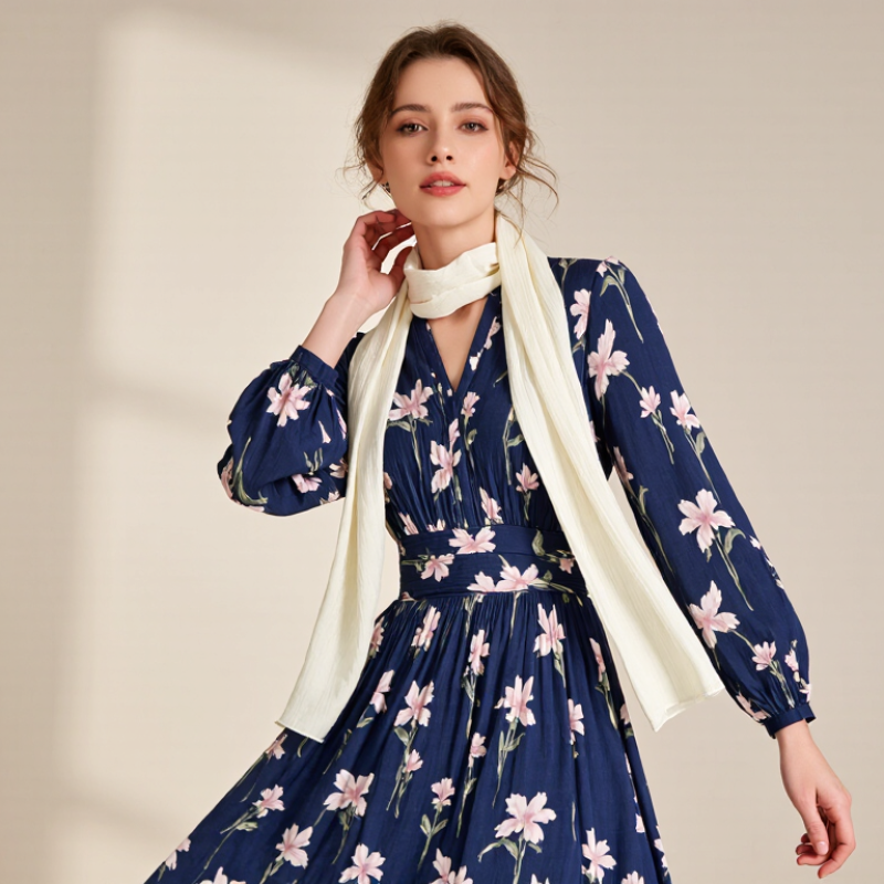
Assess the dress pattern before choosing a scarf. Count its dominant colors, then identify the scale of the print. A small floral dress usually needs a scarf with a quiet texture or a broad, solid color. Large checks can handle a narrow geometric scarf, but avoid matching every line. It often looks too deliberate.
The 2024 State of Fashion report from McKinsey and The Business of Fashion projected only 2–4% industry growth. That pressure makes versatile accessories more practical than one-season purchases. Choose a scarf that repeats one dress color, not all of them. For a navy-and-cream print, try a cream scarf with a fine woven edge. For a red abstract pattern, muted charcoal can calm the neckline. Test the combination near a window. Indoor lighting lies.
Pay attention to fabric weight. Silk-like materials suit lightweight dresses, while brushed wool works better with dense autumn prints. Keep the scarf pattern smaller than the dress pattern, unless both share one clear color. Tie it loosely at the collarbone. A bulky knot can hide the print’s best detail. I sometimes prefer a slightly imperfect drape; excessive symmetry can make an outfit feel arranged rather than lived in. The Ellen MacArthur Foundation’s textile report also emphasizes longer product use, so select a style you can wear with several dresses. That matters more than a perfect single pairing.
When a patterned dress already speaks loudly, let the scarf borrow its language. Identify the dress’s main tone first, then locate one smaller accent color. A scarf matching the main tone creates a calm, polished line. A scarf matching an accent tone feels livelier and draws attention toward the face.
Keep one color dominant. If the dress has navy leaves and small coral flowers, try a muted coral scarf for gentle contrast. The coral does not need to match perfectly. Similar warmth matters more than identical pigment. I once paired a bright orange scarf with a soft floral dress, and the result looked harsh in daylight. A dustier orange would have worked better. Color can change quickly under indoor lighting.
Use the print’s background as another option. A cream scarf can soften a dress with busy red and green details. Check the scarf’s saturation before choosing it. Strong colors compete with large prints, while quieter shades suit delicate patterns. Consider scale, too. A small scarf pattern may disappear beside a bold dress. A broad, simple scarf can balance it. Texture also affects color; wool often looks deeper than silk. Test both near a window and in a mirror. Then notice your skin, not only the clothing. If the scarf makes your face look tired, the color relationship needs adjustment. Sometimes the “correct” accent still feels wrong. Trust that evidence.
A patterned dress already attracts attention, so a simple scarf usually creates better balance. Choose a solid color before considering prints. Pull one quiet shade from the dress, such as cream, olive, or dusty blue. This connects the outfit without making it look overly planned. I often place the scarf beside the dress in daylight. Indoor lighting can change colors surprisingly.
Keep the scarf’s fabric calm when the dress has strong geometric shapes. Smooth cotton works well with busy floral patterns, while soft wool can soften sharp lines. Watch the scale, too. A large scarf may overwhelm a small figure or hide the dress’s main detail. Fold it narrowly and let the ends fall naturally. A loose drape often looks more polished than a tight knot. I sometimes choose a slightly deeper shade for contrast, but this does not suit every complexion.
Keep jewelry restrained. Small earrings or a slim watch can support the scarf without competing with it. Check the neckline before tying anything. A high neckline may need the scarf over one shoulder instead. Comfort matters as well; a beautiful scarf becomes distracting when it slips constantly. I once matched a bright scarf to a tiny dress detail, and the result felt forced. That mistake reminded me to judge the whole outfit, not one color. Try the combination while walking, sitting, and checking the back view. The best pairing should look intentional, yet still feel easy.
Balance Prints by Pairing Bold Dresses With Simple Scarves
The styling balance score reflects how strongly each practical tip helps prevent visual competition between a patterned dress and a scarf. Prioritize a simple scarf, shared colors, and contrasting print scale.
A patterned dress already carries visual energy, so the scarf should support its fabric rather than compete with its print. I usually begin by touching the dress material. Smooth satin pairs well with silk, fine cotton, or lightweight modal. These fabrics echo its gentle shine and create a controlled drape around the neck. Keep the scarf slightly less glossy if the dress has a strong print.
Texture can guide the outfit more reliably than color. A linen dress benefits from a cotton voile or softly crinkled linen scarf. A knitted dress feels balanced with wool, cashmere, or brushed cotton. For a lace dress, choose a smooth scarf to avoid excessive surface detail. Too many textures can make the outfit look crowded. It happens easily.
Seven practical checks help: match weight, compare shine, test drape, limit bulky edges, repeat one dress color, protect delicate fibers, and inspect the outfit in daylight. A heavier scarf can pull down a thin dress and distort its shape. A tiny scarf may disappear beside a thick winter material. I once chose a beautiful textured scarf that looked charming alone, but its rough weave caught on the dress. That mistake changed my fitting routine.
Place both fabrics side by side before dressing. Scrunch each one gently and observe how quickly it recovers. If both collapse softly, use a relaxed knot. If one holds its shape, leave the scarf longer and simpler. Fabric behavior matters more than a perfect color match.
Coordinate Scarf Fabrics and Textures With the Dress Material
| Tip | Dress Pattern or Material | Recommended Scarf Fabric | Texture Pairing | Color Direction | Practical Styling Advice |
|---|---|---|---|---|---|
| 1 | Small floral print on cotton or linen | Lightweight cotton, linen, or cotton voile | Soft matte texture with a relaxed hand | Choose one secondary color from the floral print | Keep the scarf pattern-free or use a very subtle stripe so the small flowers remain visible. |
| 2 | Bold geometric print on smooth woven fabric | Smooth silk-like fabric, satin, or lightweight polyester | Polished surface that balances sharp lines | Use a solid shade that matches the dress background | Avoid adding another strong geometric print; a solid scarf creates a cleaner visual break. |
| 3 | Stripes, checks, or plaids on crisp cotton | Cotton poplin, lightweight wool, or fine-gauge knit | Medium structure with a neat, defined edge | Repeat one color from the lines, preferably the least dominant shade | A solid scarf is the safest option; if using a print, select a different scale and keep its colors limited. |
| 4 | Chiffon, crepe, or other fluid dress material | Chiffon, modal, viscose, or fine silk | Drapey, lightweight texture with gentle movement | Select a related tone, such as a lighter or deeper version of the dress color | Avoid heavy, rigid scarves that can overpower the fluid silhouette and create unnecessary bulk. |
| 5 | Textured knit, corduroy, or brushed fabric | Wool, cashmere-blend, brushed cotton, or ribbed knit | Warm, tactile texture that supports the dress weight | Use earthy neutrals or a muted shade already present in the pattern | Match the scarf’s visual weight to the dress; a very thin scarf may look disconnected from a heavy texture. |
| 6 | High-contrast abstract or multicolor pattern | Matte modal, lightweight wool, or plain cotton | Low-shine, smooth-to-soft texture | Choose the dominant neutral or the quietest color in the pattern | Keep the scarf visually quiet and let the dress remain the focal point of the outfit. |
| 7 | Dark patterned dress in denim, twill, or heavier jersey | Medium-weight cotton, wool, linen blend, or brushed viscose | Moderate structure with enough body to hold a knot | Add a lighter accent, warm neutral, or muted complementary color | Use the scarf near the face to brighten the outfit, but keep its pattern simple for a balanced finish. |
Let the dress lead. Choose one quiet color from its pattern, then repeat that shade in the scarf. This creates connection without making the outfit feel crowded. A cream scarf can soften sharp geometric prints, while a deep green scarf can ground floral details. Keep the scarf’s pattern smaller than the dress pattern. Scale matters.
A cream scarf can soften sharp geometric prints, while a deep green scarf can ground floral details.
Try seven practical arrangements: drape it loosely, knot it under the chin, wrap it once, tie a slim neck bow, fold it over one shoulder, belt it at the waist, or wear it as a head accent. Test each position in natural light. The same scarf can look elegant near the face but heavy around the waist. Shorter knots usually suit high necklines. Longer drapes balance open collars.
Fabric changes the result. Silk-like materials create movement, while wool adds structure and warmth. Textile Exchange’s 2024 Materials Market Report recorded global fiber production at 124 million tonnes in 2023, with projections reaching 160 million tonnes by 2030. Choosing a durable, washable scarf supports more frequent wear and reduces careless replacement. Check colorfastness before pairing it with a light dress.
I once ignored this detail. The pale fabric picked up dye from a dark accessory. Not ideal.
Finish with simple earrings and comfortable shoes, leaving the scarf as the visual bridge.
Identify the dress’s main tone first. Then find one smaller accent color. A main-tone scarf looks calm. An accent-tone scarf feels livelier near your face.
No. Similar warmth usually matters more than identical pigment. A muted coral scarf can soften navy leaves and coral flowers. Perfect matching is not required.
Choose a quieter scarf shade when the dress has large, vivid patterns. A cream scarf can calm red and green details. Strong contrast may look harsh.
Yes. The background often provides an easy coordination option. Cream, beige, or another background shade can create visual breathing room. Keep one color dominant.
Indoor lighting can change colors quickly. Bright orange may seem acceptable inside but harsh near a window. Test the scarf in daylight and in a mirror.
Smooth satin works with silk, fine cotton, or lightweight modal. Linen suits cotton voile or softly crinkled linen. Knits pair well with wool or brushed cotton.
Texture may guide the outfit better than color. Smooth scarves suit lace dresses. Rough surfaces can catch on delicate fabric. Too many textures look crowded.
Match the scarf’s weight to the dress. A heavy scarf can pull down thin fabric. A tiny scarf may disappear beside thick winter material. Test the drape first.
Trust what you see on your face. If your skin looks tired, adjust the color relationship. Sometimes the logical accent fails. That happens.
Place them side by side. Scrunch both gently and watch how quickly they recover. If both collapse softly, try a relaxed knot. If one holds shape, leave the scarf longer and simpler.
Learning how to coordinate a scarf with a patterned dress starts with understanding the dress’s print, colors, and overall mood. First, consider whether the pattern is floral, geometric, abstract, or subtly textured, then choose a scarf style that complements rather than competes with it. Use the dress’s main color as a foundation, or select a scarf that highlights one of its accent tones. When the dress has a bold or busy print, a simple scarf in a solid shade can create balance, while a quieter dress may allow a more distinctive scarf design.
Fabric and texture are equally important. Lightweight scarves pair well with soft, flowing dresses, while thicker materials can add structure to heavier fabrics. Finally, experiment with different arrangements, such as a loose drape, neat knot, or shoulder wrap, to enhance the outfit’s proportions. These practical tips make it easier to create a polished, comfortable, and coordinated appearance.
U-Rare Fashion